User experience makes or breaks your web application. Although you might not see it as your product, you're always selling an experience. Sometimes you don't even need to invent a new product - just provide better usability than your competitors and users will start to love your software. In turn, bad UX can quickly repel new visitors or discourage people from using your app in the long-term. That's why you should regularly revisit and improve parts of the app that affect the overall experience. The ultimate goal is to make the user's workflow as frictionless as possible, reduce frustration and let them solely focus on their task, while not being distracted by the app's interface.
In this post we'll share some tips and approaches on how we improved the user experience of SceneLab - an interactive graphics editor for creating mockup and branding designs.
1. Add Shortcuts for Advanced Users
Shortcuts are a great way of enabling users to accomplish repetitive work routines more quickly. People who regularly use interactive apps might intuitively try out shortcuts they expect to work, however you should still offer a legend or shortcut list to support learnability. The fact that shortcuts are usually an optional addition is what makes them so great, as new users aren't forced to learn them right away.
Keep in mind, that web apps run in browsers which also provide shortcuts. So you sometimes need to block default behaviors to make your own shortcuts function correctly. Besides that, make sure you stick to commonly used key combinations - best case scenario would be that users don't even have to learn your shortcuts as they're already familiar with them from other environments. Some basic example shortcuts your web app should support:
- CTRL+C: copy
- Ctrl+V: paste
- DEL: delete
2. Forgive Mistakes with Undo-Redo
Making mistakes that aren't easily fixed leads to frustration, which is why fault tolerance is an important UX feature. Mistakes will inevitably happen since users have different background knowledge and generally don't know the app as good as the developers do. That's where undo-redo functionality can come in very handy, enabling the user to 'go back in time' to iron out wrong steps.
By now, undo-redo is probably even an expected feature, since you can find it in so many apps. For example, you can undo your typings in any input field of your browser by default. Offering such a mechanism makes the user more confident in his working steps and promotes creativity, due to the reduced fear of undoable mistakes.
We made SceneLab's undo-redo implementation open-source, so if you happen to develop your web app with Angular, check out ngrx-wieder.
3. Make the UI Adjustable to Specific Use Cases
User interfaces don't have to be static, therefore consider providing variations that are supportive of different tasks. Not every user pursues the same objective or follows the same work routine, so making the UI dynamic let's the user control where the main focus should be.
Too much information can be distracting. Hiding parts of the interface makes users feel more comfortable and organized overall. Accordions, dropdowns or scrollable containers are common examples for blending out excessive information.
In our editor, users can hide the sidebars and fit the canvas to their screen to maximize the focus on the design area.
4. Provide Visual Feedback for Loading, Success & Error States
You don't want users to be wondering what's going on 'under the hood' of your app. If possible, every interaction by a user should lead to some kind of (usually visual) feedback to reduce confusion. For example, loading indicators prevent multiple clicks which might lead to multiple server requests, eventually slowing down the workflow even more.
Most code out there isn't 100% perfect and admittedly, it's hard to predict every edge case that could break an app. However, good error-handling can cover most issues the user might run into. By exposing meaningful error messages to the user, they can react to them directly and possibly avoid future issues. This could save you several support requests or even lost customers.
Visual feedback is a rare case in which animations are actually helpful instead of distracting. To be relevant in the context, any message to the user should be shown as an immediate response to his actions. Movement or fade-ins will be noticed more easily and can also indicate that a process is still running (think of a spinning loading symbol).
By the way, you can use tools like Sentry to monitor frontend errors and track down potential bugs. We've even written a Sentry integration guide for Angular.
5. Implement Auto-Saving Mechanisms
For the most part, web applications rely on an active internet connection to function correctly. Accordingly, the app state feels more temporary than for desktop software, due to a higher risk of data loss. To counteract this, auto-saving is a valid strategy. It takes away responsibility from the users, allowing them not to constantly worry about saving their progress and instead focus on the actual work.
Embracing the ideas of the previous chapter, showing a 'saved' feedback can reinforce the user's trust in the saving mechanism to actually work.
If you want your app to be as independent of disconnections as possible, consider additionally caching information in the local storage of the browser or using a service worker.
Recommended: Implementing Auto-Saving with Angular
6. Incorporate Drag & Drop to Reduce Clicks
Drag & drop can be leveraged to add semantic meaning to an interaction. For example, you can directly assign a position when dropping elements or share objects between distinct contexts.
Here's a more specific case: Sometimes a user might have a file for upload already sorted out in his file explorer, but opening a file input dialog requires him to navigate to it again. A much easier workflow would be to simply drag the file into the browser window. Making the drop area as large a possible will make the whole process more convenient.
In SceneLab you can drag items from within the app to quickly position them, or drop your own images on predefined areas to quickly apply them to mockups with just one interaction.
7. Use Cursors to Differentiate Interaction Types
It's a good practice to indicate which parts of the UI are interactive. This can be accomplished by showing anything other than the default cursor. In addition to that, different cursors are perfect to distinguish different types of interactions, here are some examples:
Pointerfor toggles, links and click interactions in generalMove/Dragfor global movement (like on google maps)Textfor editable text or input fields (the browser does this automatically)Not-allowedto indicate that something is preventing the interaction (e.g. user permission)
On top of this, hover effects are suitable for emphasizing interactive areas even more.
8. Disable Text-Selecting for User Interfaces
By default, text and image elements can be selected or highlighted by the user. Quite often, this happens by accident and is simply distracting, especially in apps that incorporate other drag interactions. This behavior can be turned off via the CSS-rule user-select: none;.
However, you should rather apply this to hand-picked elements instead the whole site. After all, highlighting text is still an expected feature for input fields or long text contents where the user might want to copy something.
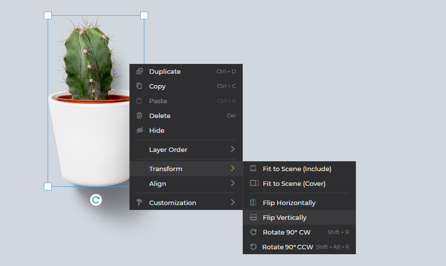
9. Add a Custom Context Menu
In contrast to plain websites that only display content, web applications often include a lot more logic and functionality. By providing a custom context menu, you can hide functionality that doesn't have to be visible all the time. Additionally, it's a great opportunity to show different menus based on the clicked object (the context), which can make certain workflows much more convenient.
One thing to consider is that a context menu usually opens right next to where the right click happened. That means you have to prevent the menu from reaching out of the viewport when the user clicks close to the edge.

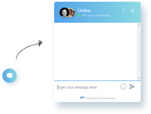
10. Embed a Support Chat
Even when you invest a lot of time into improving UX, it's unlikely that every user out there will be perfectly satisfied with your app. Offering a direct and hassle-free contact opportunity greatly increases your chances of getting valuable feedback from unhappy users. Think about it that way: If you had a bad experience using a website or app, would you want to spend even more time filling out a contact form, just to get a reply a few days later? The answer would probably be no, unless you really rely on the site to work and no alternatives exist.
Users might even have a better experience just by knowing that they could get quick support in case of any problems, making them more confident while using the app.

Wrapping up
As a developer, it's not always easy to see things from a user's perspective, who doesn't have any knowledge about your app. That's why communication in both directions is an essential strategy for improving the user experience. On the one hand, build your app in a way that guides new and advanced users, shows feedback upon interaction and incorporate UI elements and strategies that make common workflows more convenient. On the other hand, provide a direct contact opportunity like an embedded chat or actively ask users about their opinion, to obtain feedback about issues they have with the app.
Familiarity is a key factor in UX, since expected behavior will be adopted quickly while deviating from the standards might cause disapproval. Sometimes it helps to take apps as reference that are used by millions of people, such as your email client, streaming service or online banking. By analyzing their UX strategies and design decisions, you can get a hang of what's commonly expected by users. Of course these standards change over time, so evaluating and improving UX is an ongoing progress.
5 Free Business Card Mockups Without Photoshop
Presenting your business card design doesn't have to be a tedious or expensive process. With these free mockup templates you can showcase…
Introducing Mockup Design Templates
Ever needed a professional looking mockup, but creating the whole design yourself was too much hustle? However, grabbing different graphics…