As we visit a website, our attention is naturally drawn to the most prominent areas because our brains can't process all information at once. Despite the fact that top-to-bottom is the common reading flow, most users probably won't look at the website's navigation first. Instead, what usually catches our interest is the section beneath it, which separates the navigation and logo from the content and often covers a large amount of space. This area is generally referred to as hero area or hero image and can be used by designers or developers for several strategic purposes. As the title suggests, said area is sometimes included under the term 'header'.
You can compare this to a storefront where you might catch a glimpse of the actual contents inside, but what you primarily see are the signs and products displayed on the store window to catch your interest.
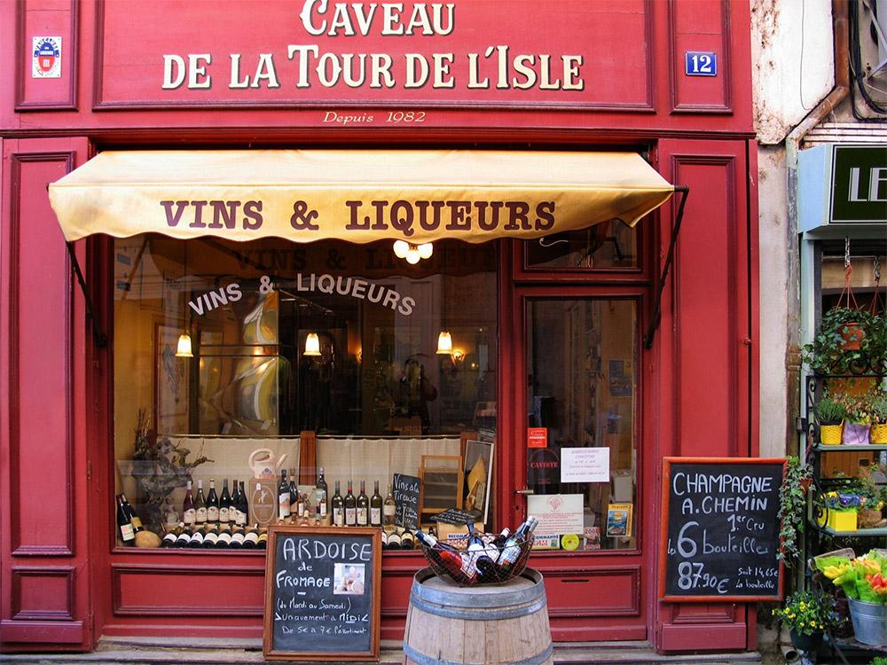
You probably identified the example above as a wine store, before reading the full name at the top. Similarly, hero areas are a great way of quickly showing key information you don't want the user to miss.
This article lists different features and variants of hero areas as well as their benefits. These shouldn't be considered standalone, but can be mixed to complement each other.
Prominent Text & Call-to-Action
Starting with the basics, text is the core tool of communicating with the viewer. Hero areas are a great place to incorporate your slogan, summarize your brand or showcase limited offers.
Simple design principles like hierarchy and contrast can be used to make the text stand out and likely to be the first thing that's catching the eye. This can be achieved using vivid background colors or gradients and a larger font size than on the rest of the website.
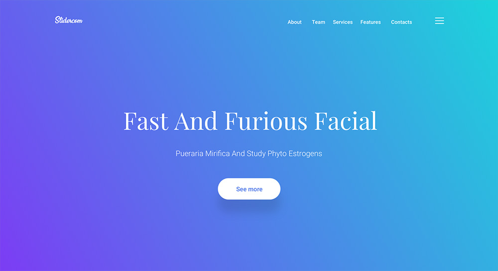
While every website has its own intention, having the user stay on the site and keep exploring it is one of the primary objectives. Longer sessions lead to increased chances of returned value, for example through a placed order or other types of conversion.
That's also why text in the hero area is often paired with buttons or links which are often referred to as a call-to-action. Their purpose is to guide the user through the site, usually offering direct shortcuts to the most interesting subpages, products, or topics.
Full-Width Images
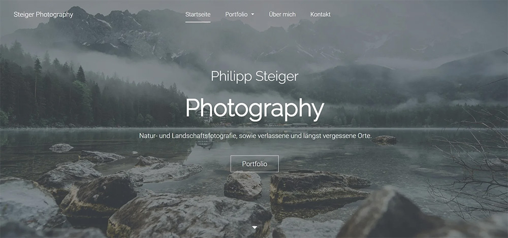
Using large photos or illustrations at the top of a website has been a big trend over the last few years. You've probably heard the quote "a picture paints a thousand words", but additionally to carrying information, a picture can also give your website a unique look and overall vibe.
High quality stock photos can help to convey professionalism, even if not directly related to your content or product.
Minimalistic images are especially suitable for this case, as they won't be too distracting and retain readability. For rather complex pictures it might be necessary to add a color overlay (or simply reduce the photos opacity), given that you have text on it.
Isolated Image Elements
By embedding individual image elements into the hero area you can create a very 'clean' and focused presentation of your matter. The previously described effect of professionalism will become even stronger, since it requires more effort and creativity than simply inserting a photo.
Besides that, incorporating smaller images gives you more control over the free space that your text is going to fill in.

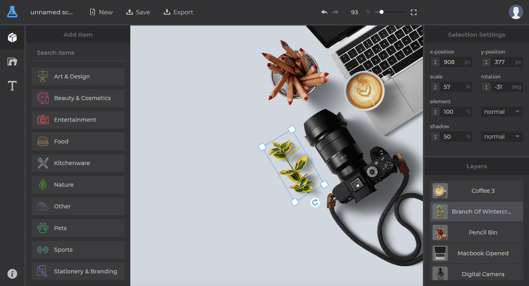
While arranging individual objects in post-production gives you the most control, there are also approaches of using similar techniques already while taking the photo. So called flatlays are a common trend in photography often used for hero images, where several items are shot from above, usually lying on a non-distracting surface.
There are thousands of photos of this kind available on stock photo sites. If you'd rather have your own, custom arrangement of objects however, you can use SceneLab's library with hundreds of isolated items to compose unique scenes. You don't need Photoshop or any other software, since the editor works right in your browser.
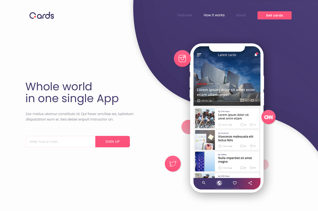
If your website is promoting an app, displaying screenshots of it using mockups is a very elegant way of showing the user what he can expect of your product. At the glimpse of an eye, they can identify the platform of your app (e.g. mobile or desktop) and already get familiar with the user interface:
Forms & Data Inputs
You could count form elements among call-to-actions, however their specific use case and higher complexity deserves its own chapter.
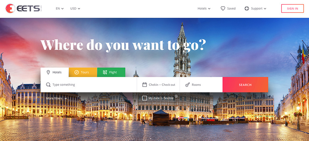
Including forms in the hero area makes sense if you either have a very high interest in collecting data or your website is heavily reliant on user inputs. The most common use of this is including a newsletter signup, as seen in the last example. For content aggregating and booking sites it's good practice to have a search form easily accessible at the top, because a searching is what a very high percentage of users plan to do in the first place. Limiting the amount of scrolling needed for that massively improves the usability and makes it more likely for people to keep using your website over the competition.
Sliders & Animations
In some occasions, switching the displayed information might be desirable. Stacking multiple hero images on top of each other misses its purpose, since the effect of prominent positioning declines on the way down.
Instead, web designers and developers often embed sliders or image carousels that either change their content automatically or through user interaction. This is a great way of highlighting not just one object, but multiple ones - for example all the featured properties on a real estate site:
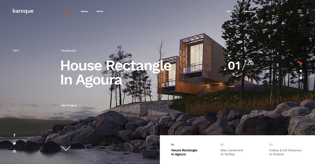
Smooth transitions are much more pleasant for the human eye and also have the advantage that the user becomes more aware of the content changes. It's better to have long pauses instead of short intervals to give even slow readers the chance to gather all information. You can still add bullet points or arrows for the user to navigate through the slides more quickly.
While animating individual parts of the hero area can be playful and fun, keep in mind, that too much movement can easily distract the viewer and doesn't add any purposeful meaning most of the times.
Videos and Streams
Running a video in the background of the hero area makes this section more dynamic and let's you show a lot of content within a short time. However, just like with animations, this comes at the cost of the users distraction or visual overstimulation. That's why only calm videos with subtle movement should be used for such purposes. Moreover, combining this technique with too much text makes it hard for the viewer to recognise which media should have the focus.
Most people consider websites to be something static that can react dynamically to their interaction. Therefore, automatically playing videos should be used with caution since this might be experienced as disruptive. In any case, you should always turn off sound by default - nobody likes to be surprised by sudden audio and having to search for its origin to shut it down.
Interactive Media
In this context, 'interactive' is supposed to mean more than just clicking a button or filling a form. Some website creators came up with really playful and creative ideas to keep the user interested while also adding a lot of recognition value. You could for example update some visuals based on the users scrolling, make game elements controllable via arrow keys or have a characters eyes follow the cursor.

Although the listed examples add a nice eyecatcher to the site, they don't convey a lot of information. The best application area for such interactive elements would be web design and development agencies, simply to showcase their skills in building awesome websites.
Conclusion
A hero image or area is a large section at the top of a website to display the most relevant information to new visitors and can also provide more visual appeal.
This section stands out due to the prominent position and combination of different media types like image and text. If you're looking for a specific reaction or interaction from the user, hero areas can quickly catch their attention and guide them towards the right direction. By applying the concepts we explored you'll get your message across and have a great chance to increase conversion.
How to Make Interesting Presentations for Software Projects
No matter how good your website or app might be, if you cannot communicate its value to your client or employer, your hard work will be…
How Developers Can Design Websites Effectively
Building websites or apps requires a range of different skills. Independent of what toolset you choose you'll have to know the basics of…