No matter how good your website or app might be, if you cannot communicate its value to your client or employer, your hard work will be overlooked. Here's a guide on how to create interesting presentations for your next software project.
Know Your Presentation Audience
Don't start by just slapping a bunch of slides together. Instead take a moment and think about who you're going to present to. This might be your boss, a potential client or an interested crowd at a conference. Think about the background knowledge your audience will posses or what it might be missing out on. Reflect on their interests. Most of the time people are not attending presentations just because they like hearing you talk. So figure out what they're looking to get out of your presentation. This might be technical knowledge, inspiration as well as strategical or economical insights.
Besides knowing such on-topic aspects about your audience, it could also come in handy to have some general conditions on your mind. This might include the time your audience is willing to spend with you. Will your listeners be relaxed or are they in a hurry and barely able to attend your presentation? You don't want people to miss your key points because they already had to leave.
Define a Goal for Your Presentation
Now that you know the people you'll be talking to, you can figure out what to give them. What's the message you want to get across? What's the goal you're trying to achieve with your presentation? You might want to get support for your next software project. You'd like to get funding for building a website or app. Maybe you're trying to sell some software you've created. Or maybe you want to show the progress of your software project to your employer or client.
Defining a specific goal for presenting your software makes crafting the actual presentation a lot easier. At every step you can ask yourself whether some slide you're going to show or a certain thing you're going to say is beneficial for reaching that goal - if it's not, throw it out.

Outline A Story
Creating a story doesn't mean you have to write a screenplay. Instead construct a cohesive outline for your presentation. I like doing this by creating some placeholder slides with certain keywords and topics. Make sure that every part of your presentation fits with the next one so that your listeners won't get lost.
I'm not a book author, but just like design has it's principles, storytelling has some as well. Start with a brief setup explaining what your presentation is all about and foreshadow where the story will be going. It's highly subjective whether a story is good. Relatability is a key factor for liking a story - that's why you researched your audience. Now you can carefully select on which parts you'd like to go into details.
All good stories have a twist. It's still a presentation so there might just not be a real twist to your topic. Still, what I mean by that is don't spill all your beans in the first five minutes. Try to intrigue the audience by leading up to something. That could be the demonstration of your software, some exciting feature or the results of a proof-of-concept trial.
Address obstacles you overcame along the way, but don't make yourself look bad by mentioning every mistake you made - that's not an interesting story, is it?
Slide Design
Don't get me wrong, I know that some people are that good at public speaking, their slides don't matter. Other times you might not even need slides and rather just stand there by yourself or with some other props. However, when presenting software projects, having some slides is usually a good idea because it's pretty difficult to convey designs and technical concepts with words only. Having off-putting slides though might still be worse than having none at all. Here are some tips that can go a long way.
Less Text, More Content
You've probably heard some arbitrary upper limit for bullet points to slap on a slide - like no more than four or five. The problem with this rule is how people apply it: they just move their remaining bullet points to the next slide.
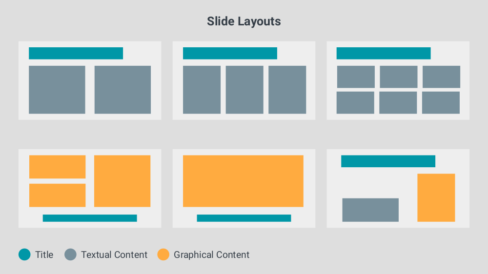
You'll get out of this dilemma, if you stop thinking in bullet points. Instead focus on the goal of your presentation and design slides that'll help you reach it. Below you can see some layouts I like to use.

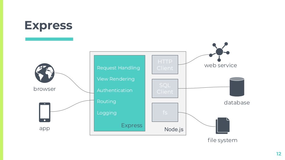
Replace text with graphics wherever possible. People are naturally more receptive for graphical representations. An ad-hoc diagram you create directly on the slide can convey much more than plain bullet points. It does so by the means of boundaries, grouping and connections.

When doing these kind of diagrams don't try to fit everything in them. Focus again on what kind of understanding you want to achieve. You can also leverage diagram standards like UML or BPMN, but keep in mind that not everyone knows these notations by heart. Some plain boxes and arrows can go a long way and it's better to have a simple diagram that's helping people instead of a complex one that's not.
If you've developed a website or app, or anything with a user interface really, you've probably got a lot to show. You can also include design iterations describing how you got to your final result. However, don't bore people by showing every single interface (or state of the same interface) there is.

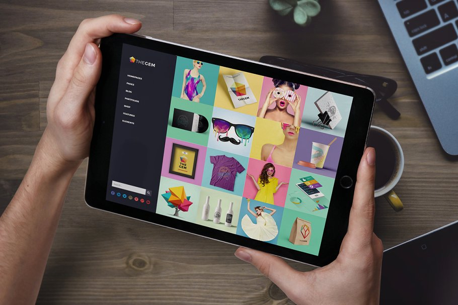
It can also be illustrative to see a mockup of your project in action - like someone holding a phone with your app open or a laptop showing your website. This will display your product in a professional and realistic look allowing people to easily picture themselves using it.
You'll find mockup resources and templates on graphics marketplaces which you can then assemble using photo editing software like Photoshop.
If you prefer an easier solution that doesn't require you to search for assets and install software, try SceneLab. Just drop your images onto phone, tablet or laptop screens right in your browser. You can choose from an ever-growing collection of professional design templates and adjust them to your needs with custom colors and texts.
Go Bold
Don't be afraid to sacrifice a whole slide to one word or number - the impact will be worth it. This could be the number of users you have, the revenue your app made or how many orders your software processed. You might also put a quote from some famous figure to give your statements more weight - though don't overdo it with that, rule of thumb: one quote max per presentation.
When you're showing images you never want to ask during presentation whether everyone can make out what's on it. Either zoom into the parts you're talking about or slice up the image.
Simple and Consistent
Limit yourself to a few font configurations consisting of font-family, font-size, font-style and color. This will give your presentation a clean look and provide consistency. Also, especially when working with little diagrams like shown above, try to work meaning into your color coding by using the same colors for roughly the same things.
Having a limited set of layouts can also be beneficial because it will allow viewers to know faster where they should be looking.
One thing I also sometimes like to do is picking an icons for each specific topic and use those consistently throughout the presentation. This could be a map when you're talking about how you planned things out or a target when it's about goals reached. If you keep to a handful different icons, you'll make these topics easily recognizable allowing you to spice up what would've otherwise been just text.
Templates & Resources
I often see people creating their presentation with a theme based on a popular movie or show. I'd advise you to refrain from doing so as you probably don't want to get into problems with copyright infringement when your slides or a video of your presentation end up on the web. Rather stay with unlicensed resources and give credit where credit is due.
Just because you think you're not very skilled at design doesn't mean your presentation has to look bad - there are templates for that! SlidesCarnival and Slidesgo are great places for free-to-use presentation templates. They list them by color, style and occasion enabling you to always find something that fits your project. They come with inspiring placeholder slides, pre-defined color schemes and a bunch of icons.
Besides presentation templates you might also find these resources helpful:
- you can find royalty free stock images on Unsplash, Pixabay or Pexels.
- if you're looking for some sweet icons try flaticon.
- when you're in need of a stimulating quote go to BrainyQuote.
Live Demos
Showing your app or website in action or doing a live coding session is somewhat the holy grail of software presentation. They can leave a major impact but might seem a bit daunting. The key here is preparation and some practice. Figure out the conditions for your demo and prepare accordingly:
- Will you have access to internet? Can your demo work without internet?
- What kind of connections are available for the projector? Bring your own adapters if necessary.
- Does your demo rely on external services (like some API) and what will you do if those services are not available?
When all falls apart skip the demonstration or, even better, have a pre-recorded video of it ready to show. This way you won't waste your precious presentation time and the audience's attention span on fixing your demonstration.
Also, for a professional impression, do some cleaning up. Clear your desktop of anything that's not related to the presentation. Close every program you don't need as you probably don't want to have delicate mail notifications during showtime. Hide the bookmarks bar of your browser not only to keep those from prying eyes but also to have more room when showing a website or web app.
Practicing Your Presentation
Practicing your presentation will not only make you more confident, you'll also know roughly how long it's going to take. Therefore don't rush while practicing because it's just practice.
You can write down some speaking notes but don't script your presentation to a point where it feels awkward. It's not the end of the world if you say something differently or forget to say it at all - after all a presentation is a live performance.
It can also be really helpful to have a test audience while practicing. This will make transitioning to a real audience much easier and you get valuable feedback early on. If there's no one available, you could still record yourself using your phone.
Conclusion
Following some basic steps will give you a solid foundation for crafting presentations. Knowing your audience, having a clearly defined goal and proper slides might also reduce stage fright, allowing you to have a good time when presenting your next software project. By having a focus on content, not being afraid to go bold and some consistency your slides will help you communicate your message much better. With a professional presentation template your slides are almost guaranteed to be interesting. Throw a carefully prepared live demonstration and some practice into the mix and you're ready!
Introducing Graphics Mockup Tooling
Over the last months we've been working intensively on an exciting new feature for SceneLab. Now, we're proud to roll-out extensive mockup…
Improving Website Headers Using Hero Images
As we visit a website, our attention is naturally drawn to the most prominent areas because our brains can't process all information at once…